Please view the slideshow I created ;
http://www.slideshare.net/nemo94/new-technoligies-po
Thursday, 8 December 2011
Wednesday, 7 December 2011
In what ways does your media product use, develop or challange forms and conventions of real media products?
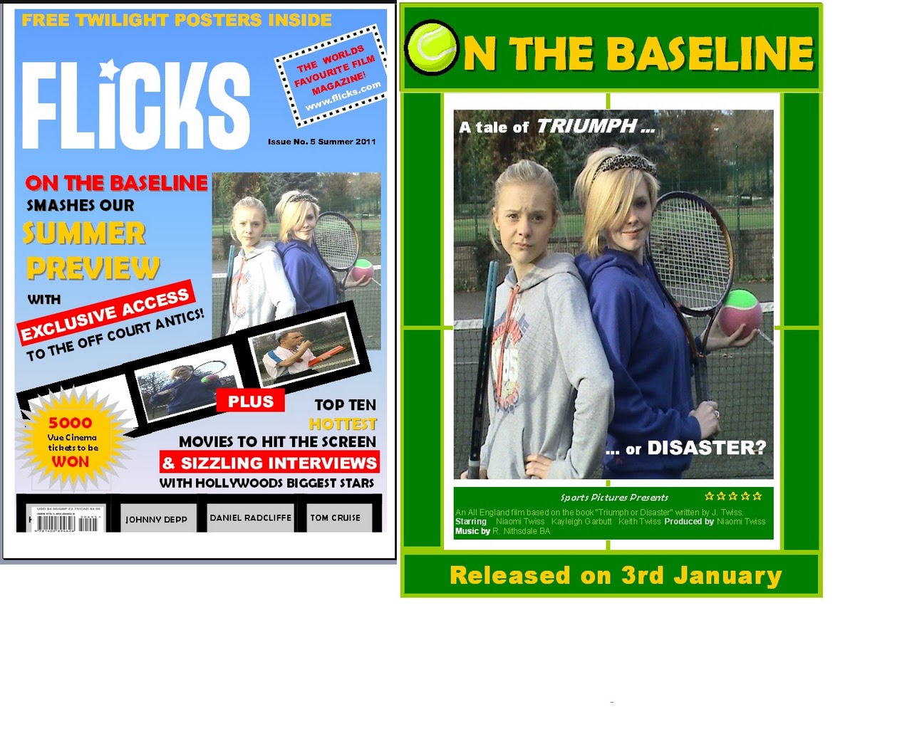
How has my magazine cover challenged and met the typical media conventions?


Please click on the images to enlarge them


In what ways does your media product use, develop or challange forms and conventions of real media products?
How has my film poster challenged and met the typical media conventions?
Please click on the images to enlarge them.


In what ways does your media product use, develop or challange forms and conventions of real media products?
How has my trailer challenged and met the typical media conventions?
http://www.slideshare.net/nemo94/in-what-ways-has-my-trailer-adhered-to
http://www.slideshare.net/nemo94/in-what-ways-has-my-trailer-adhered-to
Sunday, 4 December 2011
What have you learned from your audience feedback?
What improvements can be made to my products based on the audience feedback I have collected?
After I had finished my products I distributed a questionnaire to 10 tennis fans that met my target audience via facebook to gain feedback that could be used in the post production process and to ascertain the level of satisfaction.

The results were shown in my previous blog posts;
Funny Moments in my trailer:
Humorous moments of other trailers and why they work better than mine:

My audience evaluation indicated that some found it difficult to clearly differentiate the levels of seriousness between the two main characters shown in the poster image. To improve this I suggest that the a new image be used. The image should be more explicit and make the clash and bitter rivalry between the two girls more evident to the viewer. Real media texts such as those highlighted below achieve this well mainly through contrasting facial expressions, body language and costume:
By replacing the image with a more explicit, over the top composed pose I could also meet the second requirement of my target audience which was to make the image more comical. They were 50/50 split on whether they interpreted the image as comical. My film genre is mainly a chick flick with conventional comedy elements so its essential that I replace the image. This comical effect could be achieved through the use of props and costume as shown in the poster images below:


Magazine Cover
My target audience indicated that the cover didn't make it clear what the title of the film being covered in the main feature was. This suggests to me that the title text wasn't large enough or eye catching enough to grab the audiences attention.


The target audience also suggested that the main image used on the cover wasn't eye catching enough. I think that if the costumes were more extravagant and clearly spelled 'Tennis' that it would attract the eye of many tennis and sports fans. Also due to the seasonality of shooting the film the background in many of the shots was autumnal and dull (even though I tried to choose the brightest days for filming). I need to use photo shop to remove the background of images used.
Instead of these costumes:
After I had finished my products I distributed a questionnaire to 10 tennis fans that met my target audience via facebook to gain feedback that could be used in the post production process and to ascertain the level of satisfaction.

The results were shown in my previous blog posts;
http://nemo1994.blogspot.com/2011/11/did-i-appeal-to-target-audience-trailer.html http://nemo1994.blogspot.com/2011/11/did-i-appeal-to-target-audience-film.html http://nemo1994.blogspot.com/2011/11/did-i-appeal-to-target-audience.html
The feedback highlighted the need to improve key aspects of the products in order to meet the target audience expectations.
Trailer
The response showed that the target audience disapproved of the use of the main characters voice for the voice over in replacement of the stereotypical 'deep voice' used in most sports films trailers. Therefore to improve this I should change the voice over to a conventional deep voiced male by rerecording it.
This may make my trailer ( http://www.youtube.com/watch?v=UCIAPvFL-7Y&feature=g-upl) more appealing to the target audience.
Successful sports film trailers generally involve deep voice overs eg. Wimbledon. (http://www.youtube.com/watch?v=DTZFMhpNFfY)
In terms of humour not as many people found the trailer as funny as I would have hoped. I put this down to the fact that only 3 characters were involved in my trailer. This limits the amount of humour you can show in a 2 minute trailer as the audience is restricted to viewing action involving the same characters. Therefore, I should involve more characters to make the trailer seem more funny, even if they are not main characters. Other successful sports films do this well. I could also have used mise en scene more creatively and perhaps had shots of the players in other settings to add more variety to the humour that could have been created.
Funny Moments in my trailer:
 |
The top left photo shows the humorous part of my trailer when I use the iconic John Mcenroe line 'You cannot be serious" http://www.youtube.com/watch?v=mV1LzXf1TKQ. The bottom left photo shows Kayleigh falling down in her press up. The right hand side picture shows me later on in the trailer getting thrashed by a novice. The 3 parts are shown at 3 very different times in the trailer. They involve the same two characters, this may not sustain the audiences interest as there is no opportunity to add humour by introducing interactions with other character. |
Humorous moments of other trailers and why they work better than mine:

Poster
My audience evaluation indicated that some found it difficult to clearly differentiate the levels of seriousness between the two main characters shown in the poster image. To improve this I suggest that the a new image be used. The image should be more explicit and make the clash and bitter rivalry between the two girls more evident to the viewer. Real media texts such as those highlighted below achieve this well mainly through contrasting facial expressions, body language and costume:
 |
The image is a film poster of the film 'Meet the fockers'. The facial expressions of the two characters are highly contrasted to give the audience a clear view of a clash in personalities and allows them to differentiate between the levels of seriousness between the two characters. |
By replacing the image with a more explicit, over the top composed pose I could also meet the second requirement of my target audience which was to make the image more comical. They were 50/50 split on whether they interpreted the image as comical. My film genre is mainly a chick flick with conventional comedy elements so its essential that I replace the image. This comical effect could be achieved through the use of props and costume as shown in the poster images below:


Magazine Cover
My target audience indicated that the cover didn't make it clear what the title of the film being covered in the main feature was. This suggests to me that the title text wasn't large enough or eye catching enough to grab the audiences attention.

To improve this I should make the title text bigger and bolder as other successful film magazine covers do:


The target audience also suggested that the main image used on the cover wasn't eye catching enough. I think that if the costumes were more extravagant and clearly spelled 'Tennis' that it would attract the eye of many tennis and sports fans. Also due to the seasonality of shooting the film the background in many of the shots was autumnal and dull (even though I tried to choose the brightest days for filming). I need to use photo shop to remove the background of images used.
Instead of these costumes:
 |
| The costumes show typical sports clothing, not specifically 'Tennis' type costumes. |
I could have used professional costumes more like the Wimbledon film does to add to the verisimilitude of the production:


These costumes are all easily recognisable as tennis dress with the white colour scheme denoting Wimbledon. I could have improved my production by improving the costumes through the use of tennis dresses, head bands and the typical tennis sponsors used on the clothing such as Nike and Head.

These costumes are all easily recognisable as tennis dress with the white colour scheme denoting Wimbledon. I could have improved my production by improving the costumes through the use of tennis dresses, head bands and the typical tennis sponsors used on the clothing such as Nike and Head.
If the costumes in my magazine cover were pure white and the two girls were in tennis dresses it would provide an immediate association with the audience who would recognise the 'Tennis' type film. The problem with my costumes is that it looks more like the girls are in PE kit rather than tennis kit. Also the clothing is too dully coloured to contrast with the dull background. White dresses would really stand out from the dull coloured tennis courts.
How effective is the combination of your main product and ancillary tasks?
How effective is the combination of your main product and ancillary tasks.
Intertextuality has been achieved through:- the use of a consistent font and uppercase text for the film title (calibri).
- the use of the same main image for both products encouraging image association
- the tennis theme is evident in all products particularly through language "smashes" "off court antics." The target audience is lured clearly into the tennis theme within the magazine the promise of exclusive access to “off court antics” usually typified in popular gossip / chat / celebrity magazines.
How can the coherent links be improved:
- the title could be made more distinctive by retaining the tennis ball symbol on both the magazine and poster in order to provide a strong indication of the genre and key tennis theme of the film.
- the magazine really needs to follow a conventional format with the use of a single image. Using the same image that is used on the poster in a more prominent position on the cover would again provide the readership with an immediate association. The image denotes the bitter rivalry between the antagonist and protagonist evident in the trailer.
- I need to try to incorporate more colour association between the products which may mean rethinking how my products attract the main target audience. The poster colour scheme has been designed primarily to reflect the tennis theme although my main audience is likely to be teenage girls. Real media texts tend to utilise the colour pink to reflect the genre of the "chick flick" and to appeal to the female market. The use of pink could then be evident on the front cover of the magazine perhaps in the form of captions related directly to the film. Although I do not want to have too many miscellaneous colours that make the cover look to busy and confusing for the reader - fewer selective colours will help create the sense of a house style.
- I also want to be more specific about the target market for my film magazine. The Total Film and Empire magazines on the market seem to focus on male readers. To have consistency across my products I will try to attract a distinctive female readership and make aesthetic changes that reflect this. This would also give me the opportunity to pull all 3 of my products under the brand of my Sports Flick Film company with a portfolio of products aimed at the female audience. The use of a new compact logo will be used on all products.
- The colour scheme used on the cover of the magazine differs deliberately to those used on the film poster. The film is featured in the summer edition of “Flicks” hence the use of a light blue background, yellow and red text which reflects the seasonality indicating to the audience that it is a contemporary edition. However, the poster identifies a release date of the 3rd January so this needs to be made more consistent across all products. It is more likely that a tennis film will be released in the summer when the sport has most coverage on TV and a high profile. I will adjust my release date to coincide with the Wimbledon fortnight when interest in tennis is at it's peak.
 |
How effective is the combination of your main product and ancillary tasks?
Were there coherent links between all my products?
A strong link is shown in the fact that there is clear continuity in some of the aspects of production used across all 3 of my tasks. This shows that my tasks worked well together in combination because the two ancillary tasks were able to give an insight to the viewers into what to expect in the trailer.
1. The main image on the poster and the magazine cover is the exactly same. The image reflects the presentation of the 2 players as binary opposites. A similar image is also portrayed during the trailer when Niaomi shakes her head at Kayleigh. Costume, props and backdrop are also consistent.
 |


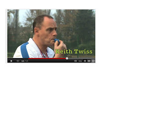
2. Keith the coach blows his whistle in the trailer, an image of him blowing his whistle is used initially on the magazine cover and the trailer.

3. Keith the coach also uses dialogue in the trailer which is also used on the poster - a tale of 'triumph or disaster?' is used to create enigma for the prospective viewer.
 |
| http://www.youtube.com/watch?v=UCIAPvFL-7Y&feature=g-upl |

How effective is the combination of your main product and ancillary tasks?
Were there coherent links between all my products?
Strong coherent links were shown as the audience was presented with the same stereotypical images of each character across the 3 products. This consistency was achieved by the poses used in the film poster, magazine cover and also by the body language used by the characters in the trailer.The image of the characters presented to the audience was:
Kayleigh: A novice, silly stupid new tennis player who was out of place on the professional tennis circuit.
Niaomi: A tough, strong minded, nasty, bratty sports champion - the typical chick flick "Queen Bee."
Keith (coach): The mean coach.
The points made in the captions explain how the consistent images and representations of the characters was retained throughout the 3 products.
 |
Image A: Facial expressions and body language used during the trailer Niaomi: The close up of her face makes the audience focus on her attitude, she clearly looks as though she is annoyed and about to kick off. Kayleigh: Stupidly smiling in a similar pose to the ones used in the poster and magazine cover. The medium shot allows us to see that she is holding the big tennis ball and the tennis racket. She holds them as if she doesn't know what to do with them. Keith: The close up of his face allows us to see that he is clearly not impressed, he looks as though he is about to kick off. He also looks mean. |
|
| Image B: Image used in the Poster The fact that the two girls are stood back to back conveys a clash in personalities, this is shown in the trailer also. They are presented, initially as binary opposites. Niaomi's face suggests that she isn't impressed with Kayleigh and she is standing as though she is about to force Kayleigh out of the way, this makes her looks like a mean brat. Kayleigh's hair is in her face conveying shes a novice and she is still smiling even though Niaomi isn't impressed, showing she is slightly stupid. |
|
| Image C: The images used in the Magazine cover The main image of Niaomi and Kayleigh is the same as in the poster showing the maintained house style. The small image of Kayleigh is a different pose but displays the same kind of character. She is nearly holding the racket over her face, showing that she is stupid. She also has the same silly smile on her face and is holding the tennis ball as if she is unsure of what to do with it, displaying she is a novice. Keith stands sideways onto the camera as if to say he hasn't got time for the viewers, his facial expression looks serious and business like. |
How effective is the combination of your main product and ancillary tasks?
Were there coherent links between all my products?; 2
Strong coherent links were shown by the continuity of the use of costumes throughout all 3 of my products.
The characters are all wearing the exact same things throughout the 3 products. This is good as it shows that the house style was clearly maintained throughout the 3 products in the form of the tennis themed costumes. It also shows that the theme of tennis was portrayed in the costumes used.
Also the setting of each of these tasks was kept the same. All filming and production tasks took place on Maltby tennis courts. Again this maintains the tennis theme and house style.
Strong coherent links were shown by the continuity of the use of costumes throughout all 3 of my products.
The characters are all wearing the exact same things throughout the 3 products. This is good as it shows that the house style was clearly maintained throughout the 3 products in the form of the tennis themed costumes. It also shows that the theme of tennis was portrayed in the costumes used.
 |
| The image shows the 3 characters at different parts in the film and the costumes used. |
|
| The image shows part of the film magazine cover where the 3 characters are in the exact same costumes. |
|
| The image shows part of the film poster where the 2 main characters are in the same costumes as they were in the other two tasks. |
Also the setting of each of these tasks was kept the same. All filming and production tasks took place on Maltby tennis courts. Again this maintains the tennis theme and house style.
How effective is the combination of your main product and ancillary tasks?
Were there coherent links between all my products?
The general theme of my products was aimed to spell tennis. Therefore when evaluating the links I looked at whether they had all given the general image of 'tennis' and whether they all looked part of the same production companies "Sports Flick Films" work.There is evidently strong coherent links in the following aspects of my tasks;
1. The font and upper type on my film poster was the same colour and style font used in the trailer and on the film poster. Calibra typeface was used as it looks professional and portrays an image of a class which is associated with tennis. The colour green also gives a typical tennis image.
 |
| The image shows the font used in my trailer and the masthead of the film poster. |
Sunday, 27 November 2011
What have you learned from your audience feedback?
Did I appeal to the target audience?
Magazine cover questionnaire resultsThe magazine cover questionnaire results were as follows, and this is what they told me.......

What have you learned from your audience feedback?
Did I appeal to the target audience?
Film Poster questionnaire results and what this tells me.The film poster questionnaire results were as follows.......

What this tells me; Please click the link to here me talk about it.
What have you learned from your audience feedback?
Did I appeal to the target audience?
Trailer questionnaire results and what this tells me.The results of the trailer questionnaire were as follows.......

So what does this tell me about my trailer in terms of meeting the target audience?
Please listen to the voice recording of me talking about what this tells me.
What have you learned from your audience feedback?
Were my products effective in appealing to the target audience?
I originally stated that my target audience was sports fans, tennis fans in particular. So I decided to send a link to my trailer and ancillary tasks followed by a questionnaire to 10 tennis fans that I know to see what they thought of my trailer, film poster and magazine cover. I did this using Web 2.0 technology in the form of Facebook.
The questionnaire's asked the following questions, to be responded to by a yes or no answer.
- Did you like the fact the voice over was a character speaking and not a deep manly voice?
- Did you think that the setting was appropriate for a tennis film?
- Did you like the choices of music and sound effects throughout the trailer?
- Did the trailer make it clear as to what the plot of the film was about?
- Was it easy to tell the difference in the ability of the two tennis players?
- Did the coach come across as a mean coach?
- Were the costumes of the characters appropriate for a tennis film?
- Was the trailer funny?
- Did you want to see the film after watching the trailer?
- Overall did you like the trailer?
Film poster questionnaire;
- Did the poster give you a clear image of a tennis film?
- Could you tell from the image used that one character was serious and the other wasn’t?
- Would you be interested in seeing the film after looking at the poster?
- Did the poster appear comical?
- Overall did you like the poster?
Magazine Cover Questionnaire;
- Is the main image used for the film eye catching?
- Did the use of several images give a good insight into what the plot of the film was about?
- Would you be interested in seeing the film after viewing this magazine cover?
- Does the magazine cover make it clear to what the film is called?
- Overall did you like the magazine cover?
Saturday, 26 November 2011

Sunday, 20 November 2011

Tuesday, 15 November 2011

Sunday, 13 November 2011

Friday, 4 November 2011
Wednesday, 2 November 2011
Shooting script thursday the 3rd of november
On the Baseline - Shooting Script
This Thursday 3rd of November we will be filming the 3rd out of 4 parts to my trailer.
2.00pm – Meet in the Gym
2.10pm- Everything should be set up and we should be ready to film
2.10pm-2.50pm- Filming runs as follows
1.Verticle Panning shot of Niaomi and Lindsay , Niaomi looks unimpressed at Lindsay, Linsday looks upset.
2. Niaomi hits the ball past Lindsay in practice, Niaomi 'do you have any problems other than that you're useless, a moron and a dork?'- Niaomi looks angry
3. Over the shoulder shot from Roberts shoulder, (setting changing room/ corridor)-Action; Robert and Lindsay having a conversation
Lindsay; ' I will never be good enough'- Lindsay looks like she is about to cry
Robert; ' If you can meet with triumph and disaster and treat those two imposters just the same'- Robert looks upset for Lindsay
4. Lindsay hitting shots, doing push ups, she eventually gets one past Niaomi
Zoom in on Niaomi’s face
5. Speech; Niaomi ' you’re getting good squirt'- Niaomi looks happy for Lindsay Cutaway to Lindsay’s face, Zoom in Lindsay smiles
2.50- 3.00pm3 photo graphs to be taken
This Thursday 3rd of November we will be filming the 3rd out of 4 parts to my trailer.
2.00pm – Meet in the Gym
2.10pm- Everything should be set up and we should be ready to film
2.10pm-2.50pm- Filming runs as follows
1.Verticle Panning shot of Niaomi and Lindsay , Niaomi looks unimpressed at Lindsay, Linsday looks upset.
2. Niaomi hits the ball past Lindsay in practice, Niaomi 'do you have any problems other than that you're useless, a moron and a dork?'- Niaomi looks angry
3. Over the shoulder shot from Roberts shoulder, (setting changing room/ corridor)-Action; Robert and Lindsay having a conversation
Lindsay; ' I will never be good enough'- Lindsay looks like she is about to cry
Robert; ' If you can meet with triumph and disaster and treat those two imposters just the same'- Robert looks upset for Lindsay
4. Lindsay hitting shots, doing push ups, she eventually gets one past Niaomi
Zoom in on Niaomi’s face
5. Speech; Niaomi ' you’re getting good squirt'- Niaomi looks happy for Lindsay Cutaway to Lindsay’s face, Zoom in Lindsay smiles
2.50- 3.00pm
3 photo graphs to be taken
1. Niaomi and Lindsay stood side by side looking like rivals2. Rob writing into a notepad
3. Linsday smiling with her tennis racket
Tuesday, 18 October 2011
Shooting Script; This Thursday
This thursday i aim to get at least part 1 of the trailer filmed and take a few pictures for the poster etc.
The filming will have priority first; as we aim to get the following done in an hour, the timetable is as follows;
Arrive at 2pm in the gym.
2.10pm - everything should be set up and everbody in costume
2.15-2.50- The following should be filmed;
Bouncing Tennis ball (Lindsay), Rob Films
Mid angle shot of Niaomi waist up, Niaomi hits a serve and says 'You cannot be serious' (Rob Films)
Establishing shot of Lindsay missing the ball over again (Rob Films)
Shot reverse shot (Lindsay films) of Niaomi and Robs Conversation N'what have you done? R'trust me she has potential'
You need to bring;
Lindsay - Sports clothing ; on wednesday for storing
Robert; Yourself
Niaomi; Sports clothing, Robs costume, Tennis rackets and balls, Camera
The filming will have priority first; as we aim to get the following done in an hour, the timetable is as follows;
Arrive at 2pm in the gym.
2.10pm - everything should be set up and everbody in costume
2.15-2.50- The following should be filmed;
Bouncing Tennis ball (Lindsay), Rob Films
Mid angle shot of Niaomi waist up, Niaomi hits a serve and says 'You cannot be serious' (Rob Films)
Establishing shot of Lindsay missing the ball over again (Rob Films)
Shot reverse shot (Lindsay films) of Niaomi and Robs Conversation N'what have you done? R'trust me she has potential'
High angle shot (rob films) Lindsay falls down doing a push up looks like she is giving up
Niaomi 'it's your call' (looks disgusted) (Lindsay films)
You need to bring;
Lindsay - Sports clothing ; on wednesday for storing
Robert; Yourself
Niaomi; Sports clothing, Robs costume, Tennis rackets and balls, Camera
Saturday, 8 October 2011

Film Magazine Cover First Draft
This is the first draft of what I want my Magazine cover to look like, I drew it myself.

Sunday, 2 October 2011
Focus Groups; Adults
Focus Group Findings (Adults)
I established 3 focus groups in order to ascertain in depth qualitative feedback that could be used to influence my creative decision making. The 3 groups comprised of individuals from both my main and secondary niche audiences: Sports fans, Teenage Girls and Adults.
Adults
For my adults I asked my a male and a female what they would think of my trailer/film and what they would want from it .

1. When a trailer appears on the television what features catch your attention?
Female: Sometimes the music especially if I know the theme tune, or if I know of the actors in the film, or if I'm interested in the plot like a sports film. If it's funny! Or if it's by a writer / director that i know of!
Male: If im interested or if its funny, i like it when theres something dramatic on the trailer. If its scary!
2. What is it about a trailer that makes you want to go and see the film in cinema rather than wait for a DVD release?
Female: When it has a lot of action and leaves you in suspense and you are desperate to find out more.
Male: If it appeals to your taste, and looks dramatic and exciting.
3. Do you prefer the trailer do give alot away or a little of the films plot?
Female: I don’t want it to say too much or it would be pointless seeing the film, little snap shots are the best!
Male: Well I want to know what the film is about, I wouldn’t want to go and see a film that I haven’t a clue of the genre of, but it has to be a happy medium!
4. When seeing a film trailer based on a sports film what would you prefer the films genre to be?
Female: I enjoy a dramatic chick flick type thing, where the underdog comes out on top, with a bit of non-realism in them with a strong story line.
Male: I enjoy it to be slightly comedy based without too much drama, but I also enjoy it when they refer to real life gimmicks eg. when they use things that real people have said in the past.
5. Having two female main characters in a sports based film can sometimes be a disadvantage do you agree?
Female: 20 years ago maybe, but times have changed and females are more accepted in sport nowadays, we also have many celebrity female sports stars like Kelly Holmes and the Williams sisters.
Male: I think for some men it would make a film more funny, as they see women’s sport as a big joke!
Saturday, 24 September 2011
Film Poster Design initial ideas
Film Poster Design - My initial ideas
Originally I was going to include all three of the characters that are involved in the film enlarged on the poster. But after analysing real media posters I decided that it was more conventional to focus on the rivalry between the two girls who are the main characters. An image of Robert, who is the coach, would be made slightly smaller in similar way to the presentation on the Bend it like Beckham film poster.
Originally I was going to include all three of the characters that are involved in the film enlarged on the poster. But after analysing real media posters I decided that it was more conventional to focus on the rivalry between the two girls who are the main characters. An image of Robert, who is the coach, would be made slightly smaller in similar way to the presentation on the Bend it like Beckham film poster.
My film poster should include:
The use of a large prominent film title and a tagline
The names of the actors appearing in the film
Quotes from newspaper critics about the film
Coming soon or release date should be displayed
An appropriate pose from the actors/actresses in the image that provides an indication of key themes, a suggestion of the genre and has connotations about the plot
The focal picture should also be intriguing
The focal picture should also be intriguing
A company logo of the production company
A suitable colour scheme to appeal to the target audience and is eye catching
Age certification should be displayed
Directors and Production company details should be displayed.
Age certification should be displayed
Directors and Production company details should be displayed.
The ways in which I intend to do the following are:
The title will be at the top of the page and large
The actress’s names will be underneath the actress’s pictures
The quotes will be at the very bottom of the page or next to the actor's/actresses
The company logo will be in the bottom left of the page
The colour scheme will be white/black/green to convey the film is about tennis
The actresses will be posing back to back with tennis rackets to convey that they are rivals. Robert will be blowing a whistle to convey the stereotypical representation associated with a mean coach, he will be positioned next to Lindsay with the connotation that he is on her side.
The use of the male coach can appear to a wider market as having two females on the front cover may not interest some viewers.
The use of the male coach can appear to a wider market as having two females on the front cover may not interest some viewers.
The release date of the film will be bold and underneath the title
The overall presentation of the poster should be simple, clear and eyecatching. It will attract a passing audience and give them enough information to entice them into coming to see the full length feature film.
Magazine cover initial ideas
Magazine Cover - My initial ideas
After the analysis of magazine covers from Total Film and Empire I have come to a few conclusions of what I want from my own production:
General features will include:
- the magazines name will be clearly displayed
- The cover will be noticeable to the audience
- The key image of the female actors will be used as a focal point to attract the teenage audience
- Graphics and colours will be used to create a summery, feminine mood for the magazine
- Font size, shape and colour will be used to create a clear attractive cover
- Several cover lines will be dotted around the page indicating a good content inside
- Promotional offers, such as free posters, and competitions will be promoted
- Price, edition date and bar code will be displayed.
In addition, specific features relevant to my own production I would like to incorporate are as follows:
Firstly, I want only one actress from the film to be on it, this naturally would have to be the main character. After looking at the other film magazine covers I discovered that they don't tend to have more that one actress in them. I also need the actress or actor to be posing in a pose that gives a good indication of what the film is about for advertisement purposes. The actress needs to be in a costume that she wears in the film and give a quote about the film to advertise it also.
Secondly, I want the release date of the film to be made clear on the front cover of the magazine so that I can promote the opening to the readers. I want the actress to give a full page interview of which the page number should be made clear on the front cover of the magazine. A quote from an recognisable source should also be on the front cover of the magazine, for example a newspaper critic in order to provide an unbiased opinion of the film.
Thirdly, the colour scheme needs to on the magazine should also provide colour association with the other products are relate to the key theme of tennis. For my own cover I want green/white/black to give the impression of a film that’s about tennis. I would like the film poster to be included inside the magazine with images of the film, the page number of which these are based at should be on the front cover of the magazine. The title needs to be big and the actresses name included in the front cover of the magazine.
I want my magazine cover to show what the film is about and when it is released without over doing the amount of information given on the front cover. The best way to advertise a film is to keep it simple, to give the audience the page numbers of where they can find the information, to tell them when the film is released as soon as they look at it and to give them an idea of what the film is about without them having to read a page. This can be displayed through large text, colour schemes, and pictures etc.
Film Poster Analysis: Bend it like Beckham

There are many aspects of this poster which appeal to me:
Colour symbolism is apparent in that the use of green, orange and black used in the text relate back to the Indian flag, which represents the main culture in the film.
A quote from a critic is used in prime position at the top of the poster with the largest font size being used to emphasize the word “hilariously” and draw the audiences attention to the comedy element of the film.
Reference is also made to other well known British films ie Bridget Jones to provide a mass audience with a benchmark in terms of the quality of the production and particular the humour embedded within it.
The images on the poster are cleverly positioned. In the foreground we have the image of 2 girls from different cultural backgrounds obviously enjoying each others company. Whilst in the background we have a group of Asian women in colourful traditional dress (which contrasts with and is emphasized through the use of a white background) looking as though they are asking Jazminder to come back to them. The composition has the connotation that the characters are from different cultural worlds. Themes of gender and ethnicity are evident in the posters composition.
The emphasis in terms of the size of the font used in the title is on BEND IT rather than like Beckham. Whilst the words bend it literally refer to process of curling the ball into the net it may also have other connotations related to the fact that both characters have to “bend” deeply entrenched views held by their family members about women’s roles in order to achieve their sporting dreams.
Interestingly, apart from the use of the name of the soccer star Beckham, there is no imagery or reference in the poster to football. The white background does not reveal the setting and the costumes worn by the girls is non descript sports wear rather than football kit. This could be a devise designed to create intrigue amongst the audience and to avoid too much association with football which may alienate the female target market. Although in America women's soccer is the most popular female sport so it would be interesting to see whether the same approach to marketing was applied in that country. The emphasis of the poster is the relationships between the two girls and the conflict with their families. The poster doesn’t give away too much of the narrative but creates enough intrigue to interest a prospective audience.
Conventional features such as the credit block, production company details / logos and release date are evident on the poster.
Film Poster Analysis: Wimbledon

The promotional poster for this film is simple and clearly presented encompassing conventional features of products of this type. Key features include:
- The use of a white background which reflects the tennis theme, keeps the content of the poster sharp and clear. It draws attention to the photograph of the main characters. Simple aspects of mise en scene such as the props (racket) and costumes make the tennis theme very clear to the audience.
- The photograph is positioned to the left of the poster which is the first thing that the audience will naturally focus on. The attractive, giggling girl and serious glare from the male typify gender stereotypes. The romantic genre is apparent in the body language and relaxed clothing eg open shirt, mid riff showing.
- Reviews and quotations from film reviewers from recognised media institutions clearly identify the genre of the film as a romantic comedy and highlight the performances of known actors.
- The poster mentions other highly successful and instantly recognisable films by the same producer hoping to build on the loyalty of the audience and give this film credibility.
- The names of the stars are displayed in a conventional way by being prominently positioned on the poster in an attempt to attract a target audience of existing fans or followers.
- The Title of the film is positioned in the bottom third in order to draw the readers attention. The limited colour scheme does appeal to both male and female audiences, although I do think that the title is lost a little in the colour scheme.
- The Credit Block mentions the name of the producer etc again hoping to rely on previous films to bring in an audience..
- The release date and indication of the scale of the distribution ie in cinemas "everywhere"
- Logos are also used to denote the production company and film distributors.
Film Magazine Cover Analysis - Creative Decision Making

This edition of the TOTAL FILM magazine, whilst meeting conventions of magazine covers, influenced my creative decision making by providing me with a clear view of some of the standard features that I wanted to incorporate but also aspects of presentation that I didn't want to use on my cover. For example:
- The magazine title is clearly displayed in an easily readable large font using upper case lettering. The size of the font is something which I will replicate on my cover although I will choose a more feminine font to attract my female target audience. I will also use a single word "Flicks" as my title rather than my original idea of Film in Focus as this restricts the size of the font I can use. Also I want the magazine to be a product produced by my Sports Flick Film company so the new title aids the branding, the association with my film company and it's female target audience.
- A single image of a well known actor is used as a focal point with text overlaid. I will select a single image and overlay with text.
- The cover is noticeable to the audience particularly because of the dark, eery nature of the background which creates the mood for the magazine along with a sinister image of the Johnny Depp dressed as the Mad Hatter. This is typical imagery associated with Tim Burton productions although from a personal point of view it does not have any association with the Disney version of Alice in Wonderland that I have familiarity with and looks a little scary. As my magazine is a summer edition I will use light summery colours to make sure my audience know that it is a contemporary edition. Intertextuality will be achieved through colour association and the use of pink on all my products relating to the film.
- Sensational language such as World Exclusive!Massive...Plus... is used to entice the audience. I will adhere to this convention on my cover.
- Other articles contained in the magazine are promoted on the cover relating to additional film reviews in order to encourage purchases of the magazine. There is a limited range of font styles and colours used on cover lines. This aesthetic aspect of the presentation will be used to ensure that the cover doesn't look too fussy and confusing for the reader. Summery colours will be used.
- Free offers are promoted. This will be used on my magazine cover.
- Price, barcode and website address are displayed. These features will be included on my cover.
Film Magazine Cover Analysis

This magazine cover had various features that appealed to me:
- the use of a single image in the centre of the magazine and the white background which draws the readers eye to the blood dripping from her hand.
- the shock created by the contrast in the innocent look created via the cheer leading costume and the dripping blood.
- a quote from the main actress is included in the bottom left of the magazine to create further intrigue.
- the subliminal way that the reader is given a clue as to the horror genre of the film through aspects of the image.
- The limited use of colours for subheadings does not detract from the main image.
- Sensational language makes the content of the magazine appealing to the prospective reader.
- It has a lot of text positioned around the edge of the magazine so that it does not appear cluttered and confusing.
- Page numbers of articles are included on the front cover to assist the reader locate features that interest them easily.
- Masthead is large and in red to complement the red of the blood dripping on the main image. Part of the masthead is concealed by the photo of the cheerleader but the branding is so strong that the Total Film title is still decipherable.
- Websites, barcode and edition dates are also on display.
Monday, 19 September 2011
Logo
This is my LOGO for Sports Pictures Film production company that will be making my film. It will be used to brand both the trailer and the film poster.

Subscribe to:
Posts (Atom)