A strong link is shown in the fact that there is clear continuity in some of the aspects of production used across all 3 of my tasks. This shows that my tasks worked well together in combination because the two ancillary tasks were able to give an insight to the viewers into what to expect in the trailer.
1. The main image on the poster and the magazine cover is the exactly same. The image reflects the presentation of the 2 players as binary opposites. A similar image is also portrayed during the trailer when Niaomi shakes her head at Kayleigh. Costume, props and backdrop are also consistent.
 |

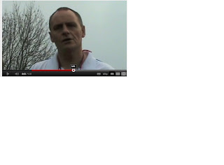
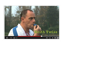
2. Keith the coach blows his whistle in the trailer, an image of him blowing his whistle is used initially on the magazine cover and the trailer.
3. Keith the coach also uses dialogue in the trailer which is also used on the poster - a tale of 'triumph or disaster?' is used to create enigma for the prospective viewer.
 |
| http://www.youtube.com/watch?v=UCIAPvFL-7Y&feature=g-upl |


No comments:
Post a Comment