How effective is the combination of your main product and ancillary tasks.
Intertextuality has been achieved through:- the use of a consistent font and uppercase text for the film title (calibri).
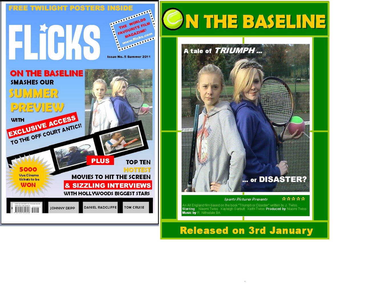
- the use of the same main image for both products encouraging image association
- the tennis theme is evident in all products particularly through language "smashes" "off court antics." The target audience is lured clearly into the tennis theme within the magazine the promise of exclusive access to “off court antics” usually typified in popular gossip / chat / celebrity magazines.
How can the coherent links be improved:
- the title could be made more distinctive by retaining the tennis ball symbol on both the magazine and poster in order to provide a strong indication of the genre and key tennis theme of the film.
- the magazine really needs to follow a conventional format with the use of a single image. Using the same image that is used on the poster in a more prominent position on the cover would again provide the readership with an immediate association. The image denotes the bitter rivalry between the antagonist and protagonist evident in the trailer.
- I need to try to incorporate more colour association between the products which may mean rethinking how my products attract the main target audience. The poster colour scheme has been designed primarily to reflect the tennis theme although my main audience is likely to be teenage girls. Real media texts tend to utilise the colour pink to reflect the genre of the "chick flick" and to appeal to the female market. The use of pink could then be evident on the front cover of the magazine perhaps in the form of captions related directly to the film. Although I do not want to have too many miscellaneous colours that make the cover look to busy and confusing for the reader - fewer selective colours will help create the sense of a house style.
- I also want to be more specific about the target market for my film magazine. The Total Film and Empire magazines on the market seem to focus on male readers. To have consistency across my products I will try to attract a distinctive female readership and make aesthetic changes that reflect this. This would also give me the opportunity to pull all 3 of my products under the brand of my Sports Flick Film company with a portfolio of products aimed at the female audience. The use of a new compact logo will be used on all products.
- The colour scheme used on the cover of the magazine differs deliberately to those used on the film poster. The film is featured in the summer edition of “Flicks” hence the use of a light blue background, yellow and red text which reflects the seasonality indicating to the audience that it is a contemporary edition. However, the poster identifies a release date of the 3rd January so this needs to be made more consistent across all products. It is more likely that a tennis film will be released in the summer when the sport has most coverage on TV and a high profile. I will adjust my release date to coincide with the Wimbledon fortnight when interest in tennis is at it's peak.
 |
No comments:
Post a Comment