Showing posts with label Coherence of the products. Show all posts

Wednesday, 18 April 2012

Post Production improvements to ancillary tasks

In terms of my ancillary tasks I had to undertake a lot of post production work and develop new skills to improve the overall quality of my film magazine cover and film poster.  On reflection, I think that I could have saved myself a lot of work by having a clearer specific target audience in mind (ie main audience teenage girls and secondary niche audience tennis fans) as trying to appeal to a wider market resulted in the creation of initial products that didn’t have a consistent “house style” or brand identity across the 3 platforms. Through a continuous cycle of drafting, designing, editing, consulting and redrafting in the post production phase I eventually produced a range of products that appeal to my target audience and have intertextuality.

-          Through the use of Photoshop software and the magic wand tool I erased the dark background of my main photograph which was then of sufficient quality to use on both the film poster and the film magazine.  It also allowed me to adhere to the conventional presentation techniques used on the front cover whereby a single image is used and overlaid with text.

-          Through revisiting the research undertaken into media texts with a clear target audience in mind I used colour symbolism more effectively.  The conventional pink became more evident across the range of products.  The background of the tennis court on the poster was filled with pink and all text relating to the film on the magazine cover was pink.  The colour scheme on the magazine was edited to create a summery feel reflecting the seasonality of the edition which is a conventional feature of magazines targeting women as it denotes the contemporary nature of the publication.

-          From target audience feedback and revisiting the real media texts I also changed the title of my film magazine from Focus on Film to a conventional single word title “Flicks.”  This was more appealing to my target audience, has connotations with “chick flicks” and a nostalgic relevance as flicks is an old world for cinema.  It directly associated the magazine brand of my production company “Sports Flick Films” which also produce the magazine.  The choice of font used for the title / masthead “flicks” was consistent across all products encouraging image association.

-          Conventional features of both magazines and posters were added during post production to add to the overall realism of the products.  A facebook link, age certificate symbol and company credits were added to the film poster whilst barcodes, issue number, dates, competitions and free offers were added to the magazine cover.

-          I also used Photoshop to create a simple company logo that could brand the media product across all 3 platforms.  My initial logo was a combination of clipart pictures of sports equipment which was not easily reproducible in the small space of poster / magazine covers. 
I looked at sports firms logos eg adidas and produced a sharper, abstract image and retained the pink colour symbolism and same font on the “flick” to provide intertextuality and visual association across all 3 products.

New logo for sports flick films

NEW COMPANY LOGO for 
SPORTS FLICK FILMS
In order to brand all 3 products I created a new logo for my company.  The original logo comprised of a series of separate clipart images which were not compact or versatile enough to position effectively on the products.  The new logo comprises of abstract arrows containing the name of the company.  The logo aims to position the company as a provider of chick flicks with a sports related theme.  Colour association is achieved with the pink FLiCK arrow reflecting the chick flick genre and female audience being targeted by the company.  The logo appears in it’s horizontal form on all 3 products.  The FliCKS font (pussycat font) is used as the title of the companies film magazine (Flicks) to create intertextuality and to cleverly promote the company name.  Inspiration was drawn from simple sporting logos such as Adidas and Nike which appeal to the sporting nature of the female target audience.


Sunday, 4 December 2011

How effective is the combination of your main product and ancillary tasks?

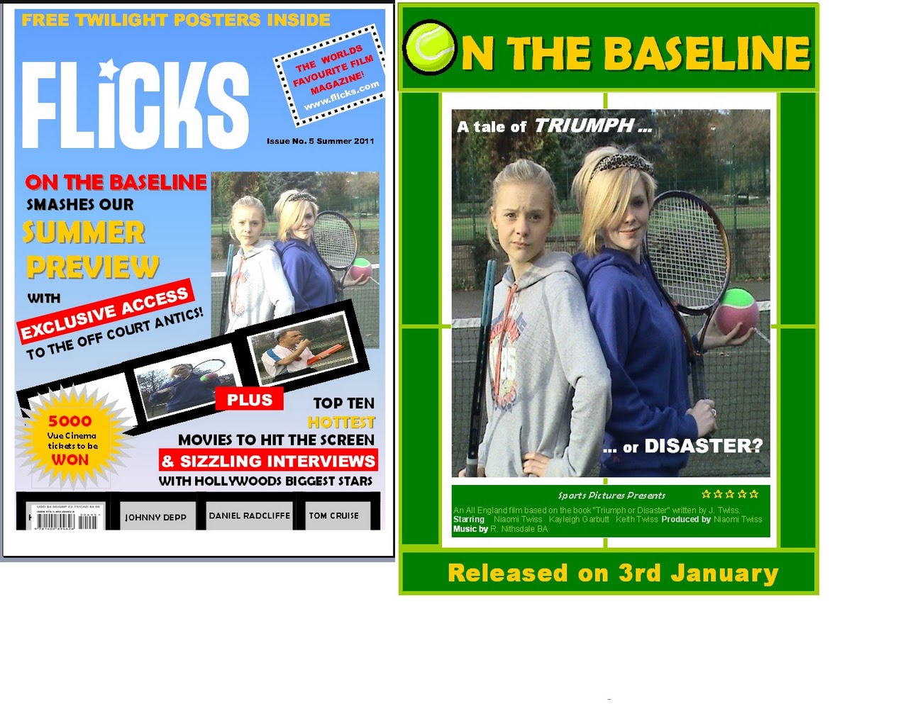
How effective is the combination of your main product and ancillary tasks.

Intertextuality has been achieved through:

- the use of a consistent font and uppercase text for the film title (calibri).
- the use of the same main image for both products encouraging image association
- the tennis theme is evident in all products particularly through language "smashes" "off court antics."  The target audience is lured clearly into the tennis theme within the magazine the promise of exclusive access to “off court antics” usually typified in popular gossip / chat / celebrity magazines.

How can the coherent links be improved:

- the title could be made more distinctive by retaining the tennis ball symbol on both the magazine and poster in order to provide a strong indication of the genre and key tennis theme of the film.

- the magazine really needs to follow a conventional format with the use of a single image.  Using the same image that is used on the poster in a more prominent position on the cover would again provide the readership with an immediate association.  The image denotes the bitter rivalry between the antagonist and protagonist evident in the trailer.

- I need to try to incorporate more colour association between the products which may mean rethinking how my products attract the main target audience.  The poster colour scheme has been designed primarily to reflect the tennis theme although my main audience is likely to be teenage girls.  Real media texts tend to utilise the colour pink to reflect the genre of the "chick flick" and to appeal to the female market.  The use of pink could then be evident on the front cover of the magazine perhaps in the form of captions related directly to the film.  Although I do not want to have too many miscellaneous colours that make the cover look to busy and confusing for the reader - fewer selective colours will help create the sense of a house style.

- I also want to be more specific about the target market for my film magazine.  The Total Film and Empire  magazines on the market seem to focus on male readers.  To have consistency across my products I will try to attract a distinctive female readership and make aesthetic changes that reflect this.  This would also give me the opportunity to pull all 3 of my products under the brand of my Sports Flick Film company with a portfolio of products aimed at the female audience.  The use of a new compact logo will be used on all products.

- The colour scheme used on the cover of the magazine differs deliberately to those used on the film poster. The film is featured in the summer edition of “Flicks” hence the use of a light blue background, yellow and red text which reflects the seasonality indicating to the audience that it is a contemporary edition.  However, the poster identifies a release date of the 3rd January so this needs to be made more consistent across all products.  It is more likely that a tennis film will be released in the summer when the sport has most coverage on TV and a high profile.  I will adjust my release date to coincide with the Wimbledon fortnight when interest in tennis is at it's peak.


Finally, the magazine cover has more content than the film poster as the purpose is to sell the total content of the publication to the browsing reader. This means that other articles have to be promoted on the cover to entice the prospective reader to purchase the magazine. This cover has been designed to offer something which appeals the widest range of readers without being too cluttered.


How effective is the combination of your main product and ancillary tasks?

Were there coherent links between all my products?

A strong link is shown in the fact that there is clear continuity in some of the aspects of production used across all 3 of my tasks. This shows that my tasks worked well together in combination because the two ancillary tasks were able to give an insight to the viewers into what to expect in the trailer.

1. The main image on the poster and the magazine cover is the exactly same. The image reflects the presentation of the 2 players as binary opposites.  A similar image is also portrayed during the trailer when Niaomi shakes her head at Kayleigh.  Costume, props and backdrop are also consistent.


2. Keith the coach blows his whistle in the trailer, an image of him blowing his whistle is used initially on the magazine cover and the trailer.


3. Keith the coach also uses dialogue in the trailer which is also used on the poster - a tale of 'triumph or disaster?' is used to create enigma for the prospective viewer.

http://www.youtube.com/watch?v=UCIAPvFL-7Y&feature=g-upl


How effective is the combination of your main product and ancillary tasks?

Were there coherent links between all my products?

Strong coherent links were shown as the audience was presented with the same stereotypical images of each character across the 3 products. This consistency was achieved by the poses used in the film poster, magazine cover and also by the body language used by the characters in the trailer.

The image of the characters presented to the audience was:

Kayleigh: A novice, silly stupid new tennis player who was out of place on the professional tennis circuit.
Niaomi: A tough, strong minded, nasty, bratty sports champion - the typical chick flick "Queen Bee."
Keith (coach): The mean coach.

The points made in the captions explain how the consistent images and representations of the characters was retained throughout the 3 products.


Image A: Facial expressions and body language used during the trailer

Niaomi:     The close up of her face makes the audience focus on her attitude, she clearly looks as though she is annoyed
                  and about to kick off.
Kayleigh: Stupidly smiling in a similar pose to the ones used in the poster and magazine cover. The medium shot allows
                  us to see that she is holding the big tennis ball and the tennis racket. She holds them as if she doesn't know
                  what to do with them.
Keith:       The close up of his face allows us to see that he is clearly not impressed, he looks as though he is about to kick
                  off. He also looks mean. 

Image B: Image used in the Poster

The fact that the two girls are stood back to back conveys a clash in personalities, this is shown in the trailer also.  They are presented, initially as binary opposites.  Niaomi's face suggests that she isn't impressed with Kayleigh and she is standing as though she is about to force Kayleigh out of the way, this makes her looks like a mean brat. Kayleigh's hair is in her face conveying shes a novice and she is still smiling even though Niaomi isn't impressed, showing she is slightly stupid.

Image C: The images used in the Magazine cover

The main image of Niaomi and Kayleigh is the same as in the poster showing the maintained house style. The small image of Kayleigh is a different pose but displays the same kind of character. She is nearly holding the racket over her face, showing that she is stupid. She also has the same silly smile on her face and is holding the tennis ball as if she is unsure of what to do with it, displaying she is a novice. Keith stands sideways onto the camera as if to say he hasn't got time for the viewers, his facial expression looks serious and business like.


How effective is the combination of your main product and ancillary tasks?

Were there coherent links between all my products?; 2

Strong coherent links were shown by the continuity of the use of costumes throughout all 3 of my products.
The characters are all wearing the exact same things throughout the 3 products. This is good as it shows that the house style was clearly maintained throughout the 3 products in the form of the tennis themed costumes. It also shows that the theme of tennis was portrayed in the costumes used.

The image shows the 3 characters at different parts in the film and the costumes used.

The image shows part of the film magazine cover where the 3 characters are in the exact same costumes.

The image shows part of the film poster where the 2 main characters are in the same costumes as they were in the other two tasks. 

Also the setting of each of these tasks was kept the same. All filming and production tasks took place on Maltby tennis courts. Again this maintains the tennis theme and house style.

How effective is the combination of your main product and ancillary tasks?

Were there coherent links between all my products?

The general theme of my products was aimed to spell tennis. Therefore when evaluating the links I looked at whether they had all given the general image of 'tennis' and whether they all looked part of the same production companies "Sports Flick Films" work.

There is evidently strong coherent links in the following aspects of my tasks;

1. The font and upper type on my film poster was the same colour and style font used in the trailer and on the film poster. Calibra typeface was used as it looks professional and portrays an image of a class which is associated with tennis. The colour green also gives a typical tennis image.

The image shows the font used in my trailer and the masthead of  the film poster. 

Monday, 19 September 2011

Logo

This is my LOGO for Sports Pictures Film production company that will be making my film.  It will be used to brand both the trailer and the film poster.